| | Forum Logo contest |  |
|
+14PurpleHaze42 Orange Boxx Crazy Hube Darklight bigdogdewey2 ncorn38 Xx_Black-out Imperial AT-FJ CarolinaCruiser15 tbulluck totald ULTIMATEcruiser FonnieJr David B 18 posters |
|
| Author | Message |
|---|
bigdogdewey2
ADMINISTRATOR


Posts : 3697
Points : 8476
Join date : 2011-08-30
Age : 55
Location : High Point, NC
| Subject: second NICKS  Thu Jan 19, 2012 6:36 pm Thu Jan 19, 2012 6:36 pm | |
| David , i too like Nicks idea..with the rising sun...that would look hot | |
|
| | |
ncorn38
MODERATOR - Trail Scout

Posts : 284
Points : 5027
Join date : 2011-05-09
Location : Kannapolis NC
| | Subject: Re: Forum Logo contest Thu Jan 19, 2012 6:56 pm | |
| | |
|
| | |
Guest
Guest
| | Subject: Re: Forum Logo contest Thu Jan 19, 2012 7:28 pm | |
| - David B wrote:
- Nick, I like what you did with the design below, what about trying this one in the sun:
 I guess I'm from the less is more school because I really like this... The ONLY thing I would do is add the url on it so people that see the decal can get here! If nothing else add it under the box! |
|
| | |
Xx_Black-out
South Carolina Liaison

Posts : 433
Points : 5083
Join date : 2011-10-29
Age : 36
Location : Easley, SC
| |
| | |
totald
SUPPORTING MEMBER
Posts : 1293
Points : 6099
Join date : 2011-05-09
Age : 47
Location : Moyock, NC
| | Subject: Re: Forum Logo contest Thu Jan 19, 2012 9:50 pm | |
| | |
|
| | |
CarolinaCruiser15
Gunner

Posts : 1720
Points : 6591
Join date : 2011-05-09
Age : 42
Location : Raleigh, NC
| | Subject: Re: Forum Logo contest Thu Jan 19, 2012 9:58 pm | |
| | |
|
| | |
bigdogdewey2
ADMINISTRATOR
Posts : 3697
Points : 8476
Join date : 2011-08-30
Age : 55
Location : High Point, NC
| | Subject: Re: Forum Logo contest Thu Jan 19, 2012 10:10 pm | |
| - Xx_Black-out wrote:
- Logo 6:
 LOGO 6 LOGO 6...this is the one..best so far... | |
|
| | |
totald
SUPPORTING MEMBER
Posts : 1293
Points : 6099
Join date : 2011-05-09
Age : 47
Location : Moyock, NC
| | Subject: Re: Forum Logo contest Thu Jan 19, 2012 10:36 pm | |
| | |
|
| | |
Guest
Guest
| | Subject: Re: Forum Logo contest Thu Jan 19, 2012 10:55 pm | |
| It appears that there is a red outline around the letters at the top I would take that off due to the fact we will be using this for so many different things little small details like that would probably get lost. also I woul probably take the est 2010 and move it down and make it a different size to take up the space in the wilmington area of the state.
as said about this is the best logos yet it doesn't look like clipart and makes a good representation of our organization.
great job |
|
| | |
CarolinaCruiser15
Gunner
Posts : 1720
Points : 6591
Join date : 2011-05-09
Age : 42
Location : Raleigh, NC
| | Subject: Re: Forum Logo contest Thu Jan 19, 2012 10:58 pm | |
| - paulwardinc wrote:
- It appears that there is a red outline around the ladders at the top I would take that off due to the fact we will be using this for so many different things little small details like that would probably get lost. also I woul probably take the est 2010 and move it down and make it a different size to take up the space in the wilmington area of the state.
as said about this is the best logos yet it doesn't look like clipart and makes a good representation of our organization.
great job Good points... especially about the red. Didnt even notice that. Not sure about the "est. 2010" part though. It seems like the lettering goes from bigger to smaller the further down you go. Im afraid if the lettering is any bigger, it would take away from the "NCFJ Cruisers". Just my opinion =) | |
|
| | |
ULTIMATEcruiser
ADMINISTRATOR
Posts : 650
Points : 5417
Join date : 2011-05-08
Age : 52
Location : Sophia, NC
| | Subject: Re: Forum Logo contest Thu Jan 19, 2012 11:01 pm | |
| What does everyone think of actually having NCFJ Cruisers in the logo twice? What can we do to have just once? I really like the design alot but now I am thinking NCFJ Cruisers in there twice plus the website address makes it 3 times. | |
|
| | |
David B
ADMINISTRATOR

Posts : 2677
Points : 8277
Join date : 2011-05-01
Age : 51
Location : Wake Forest, NC
| | Subject: Re: Forum Logo contest Thu Jan 19, 2012 11:13 pm | |
| I think it is AWESOME!!! I also agree with Jami and would like to see a version with the NCFJ Cruisers removed from the top of the logo since it looks SOOO GOOD down below in the sun! I think we are sooo close and this is a fantastic idea!!!
Nick, way to go man!!! | |
|
| | |
tbulluck
Tail Gunner

Posts : 812
Points : 5615
Join date : 2011-05-11
Age : 44
Location : greenville, nc
| | Subject: Re: Forum Logo contest Thu Jan 19, 2012 11:23 pm | |
| | |
|
| | |
Xx_Black-out
South Carolina Liaison
Posts : 433
Points : 5083
Join date : 2011-10-29
Age : 36
Location : Easley, SC
| | Subject: Re: Forum Logo contest Thu Jan 19, 2012 11:58 pm | |
| - paulwardinc wrote:
- It appears that there is a red outline around the letters at the top I would take that off due to the fact we will be using this for so many different things little small details like that would probably get lost. also I woul probably take the est 2010 and move it down and make it a different size to take up the space in the wilmington area of the state.
as said about this is the best logos yet it doesn't look like clipart and makes a good representation of our organization.
great job I'm working on touching up the lettering and removing the red/black outline around the "NCFJ cruisers" but I'm afraid without the outline to break up the edges it will not look right. ...we'll see in a few | |
|
| | |
Darklight
Tail Gunner
Posts : 651
Points : 5304
Join date : 2011-08-31
Location : Charlotte,NC 28278
| | Subject: Re: Forum Logo contest Fri Jan 20, 2012 12:12 am | |
| Logo 6 looks pretty good.
We are working on one that is a completely different concept just for some variation. | |
|
| | |
Xx_Black-out
South Carolina Liaison
Posts : 433
Points : 5083
Join date : 2011-10-29
Age : 36
Location : Easley, SC
| | Subject: Re: Forum Logo contest Fri Jan 20, 2012 12:16 am | |
| Sweet! More options are always a good thing! | |
|
| | |
David B
ADMINISTRATOR
Posts : 2677
Points : 8277
Join date : 2011-05-01
Age : 51
Location : Wake Forest, NC
| | Subject: Re: Forum Logo contest Fri Jan 20, 2012 12:17 am | |
| - Darklight wrote:
- Logo 6 looks pretty good.
We are working on one that is a completely different concept just for some variation. Sweet! Now we have the ball rolling!!! | |
|
| | |
Darklight
Tail Gunner
Posts : 651
Points : 5304
Join date : 2011-08-31
Location : Charlotte,NC 28278
| | Subject: Re: Forum Logo contest Fri Jan 20, 2012 12:45 am | |
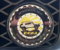
|  What do you think of this idea? Feedback is welcome. This artwork was created in a vector art program so that it is ready to use for screenprinting shirts, stickers, etc. 
Last edited by Darklight on Tue Jan 24, 2012 9:54 pm; edited 2 times in total | |
|
| | |
Xx_Black-out
South Carolina Liaison
Posts : 433
Points : 5083
Join date : 2011-10-29
Age : 36
Location : Easley, SC
| | Subject: Re: Forum Logo contest Fri Jan 20, 2012 12:47 am | |
| - paulwardinc wrote:
- It
appears that there is a red outline around the letters at the top I
would take that off due to the fact we will be using this for so many
different things little small details like that would probably get lost.
also I woul probably take the est 2010 and move it down and make it a
different size to take up the space in the wilmington area of the state.
as said about this is the best logos yet it doesn't look like clipart and makes a good representation of our organization.
great job  - David B wrote:
- I think it is AWESOME!!! I also agree with Jami and would like to see a version with the NCFJ Cruisers removed from the top of the logo since it looks SOOO GOOD down below in the sun! I think we are sooo close and this is a fantastic idea!!!
Nick, way to go man!!! lol somehow I missed this idea completely earlier! Okay, I enlarged it a little to fill up some room. What do you guys think about the text being spread out? here:  | |
|
| | |
Xx_Black-out
South Carolina Liaison
Posts : 433
Points : 5083
Join date : 2011-10-29
Age : 36
Location : Easley, SC
| | Subject: Re: Forum Logo contest Fri Jan 20, 2012 12:47 am | |
| | |
|
| | |
David B
ADMINISTRATOR
Posts : 2677
Points : 8277
Join date : 2011-05-01
Age : 51
Location : Wake Forest, NC
| | Subject: Re: Forum Logo contest Fri Jan 20, 2012 12:49 am | |
| | |
|
| | |
Darklight
Tail Gunner
Posts : 651
Points : 5304
Join date : 2011-08-31
Location : Charlotte,NC 28278
| | Subject: Re: Forum Logo contest Fri Jan 20, 2012 12:50 am | |
| My wife Lisa drew this from scratch in Illustrator. We spent several hours getting it the way we liked it. I think it came out good! | |
|
| | |
CarolinaCruiser15
Gunner
Posts : 1720
Points : 6591
Join date : 2011-05-09
Age : 42
Location : Raleigh, NC
| |
| | |
David B
ADMINISTRATOR
Posts : 2677
Points : 8277
Join date : 2011-05-01
Age : 51
Location : Wake Forest, NC
| | Subject: Re: Forum Logo contest Fri Jan 20, 2012 12:56 am | |
| I placed a copy of the last one on the portal.....looks sweet! | |
|
| | |
David B
ADMINISTRATOR
Posts : 2677
Points : 8277
Join date : 2011-05-01
Age : 51
Location : Wake Forest, NC
| | Subject: Re: Forum Logo contest Fri Jan 20, 2012 12:57 am | |
| - Darklight wrote:
- My wife Lisa drew this from scratch in Illustrator. We spent several hours getting it the way we liked it. I think it came out good!
Very nice!!! | |
|
| | |
Sponsored content
| | Subject: Re: Forum Logo contest | |
| |
|
| | |
| | Forum Logo contest | |
|


